Product design · Self-directed brief

One screen for the person running the whole race day.

A 24-hour design exercise for the AMG Driving Academy: a dashboard for the one person who has to watch the track, the marshals, safety and the crowd, all at once.
Role
Solo · research
to UI
Time
24 hours
start to finish
Built for
Race event
organizers
Surface
Web app
laptop & tablet
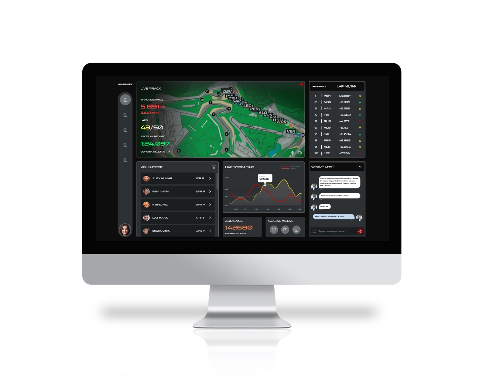
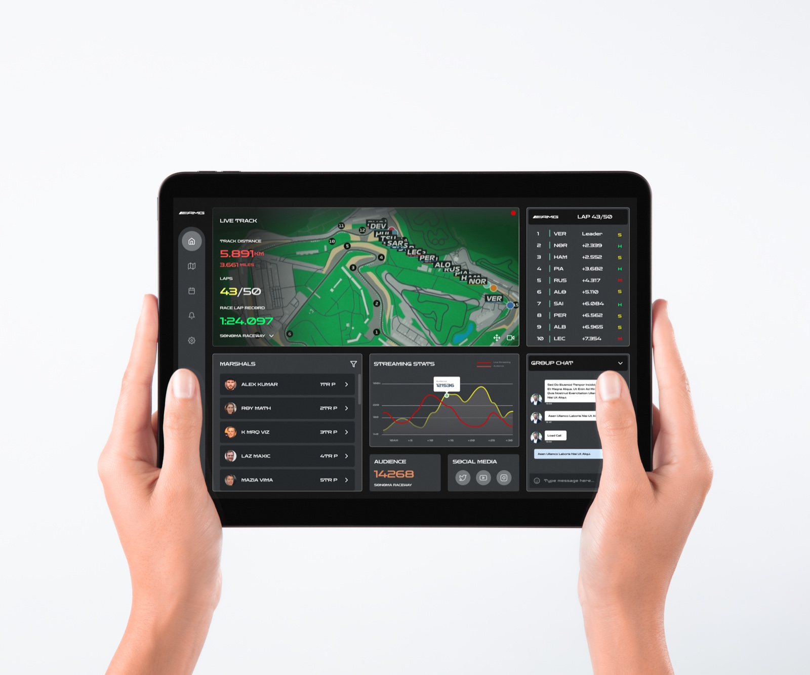
The AMG Driving Academy dashboard, shown on a tablet held trackside: live track map, leaderboard, marshals, streaming stats and a team chat.
Quick context — this was a self-directed 24-hour brief, not a client project. There was no real organizer to interview and nothing here shipped. I'm showing it because the constraint — one day, one clear user, real screens by the end — is exactly the kind of pressure I like designing under.
01 Why

A race day runs on a dozen tools. It should run on one.

The brief: AMG wanted a platform for its Driving Academy — six levels of high-speed track events in Mercedes-AMG cars — that could host a race day end to end. Not just registration. The whole thing: who's on track, who's marshaling which corner, what the crowd is doing, whether the livestream is holding up.

I didn't have real organizers to sit with in 24 hours, so I worked backward from the job itself: everything that actually happens to put on a race, from the first planning meeting to the post-event cleanup. That process, not a persona interview, is what told me what the dashboard needed to show.

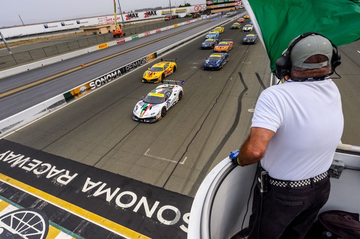
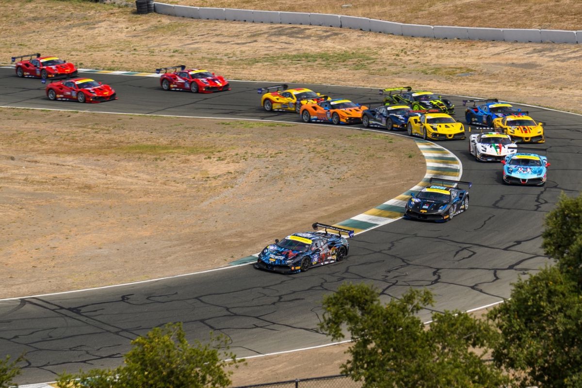
Mercedes-AMG race cars on track
Six levels of driving, from track day to full race.
A marshal trackside
The people who keep a race day safe.
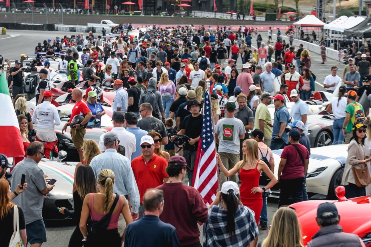
A race-day crowd
The crowd an organizer is also responsible for.
02 Who I designed for

One organizer, doing five people's jobs at once.

I sketched two organizer profiles to keep the design honest about who'd actually be using this under pressure — not real interview subjects, but two believable versions of the same job.

Illustrated avatar for the Sarah persona

Sarah, races and festivals

5+ years organizing · urban

Detail-first. Runs races, conferences and festivals, and wants one place that shows every moving part rather than five browser tabs.

Illustrated avatar for the David persona

David, large-scale sport

10+ years organizing · suburban

Handles marathons and triathlons. Needs live, trustworthy numbers so he can make a call on the spot, not after the fact.

Both of them need the same thing at different volumes: one view they can trust while standing trackside, not a dashboard they have to go hunting through. That single sentence became the design brief.

03 What I built

A dashboard that puts the track first and everything else around it.

The live track map and leaderboard anchor the screen — that's the thing an organizer's eyes go to first. Marshals, safety, livestream numbers and a team chat sit around it, each one answering a question I'd have on race day: is everyone safe, is the stream up, who do I radio right now.

01

Live track & leaderboard

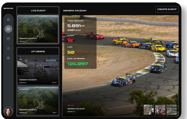
Distance, laps, lap record, and real-time positions with gaps — the one thing that has to be right at a glance.

02

Marshals, on one list

Who's covering which post and whether they're reachable, so a problem gets a name attached to it fast.

03

Streaming & audience, live

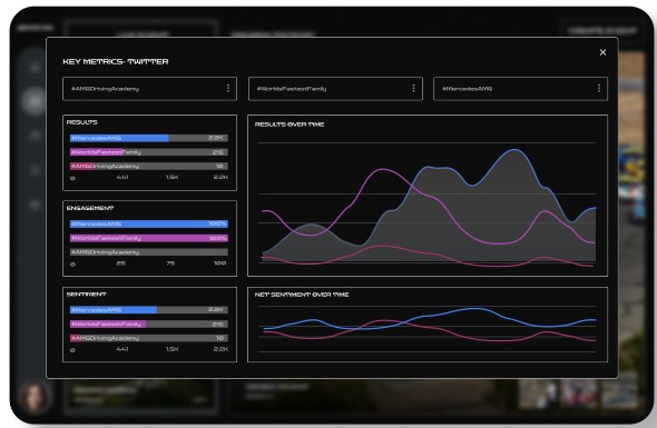
Viewer count and social reach next to the operational data — the public side of the event, not a separate report.

04

A team chat, built in

No separate walkie-talkie app or group chat. Coordination happens on the same screen as everything else.

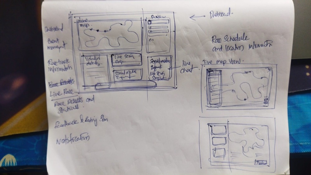
Hand-drawn sketch of the dashboard layout, on paper
First pass, on paper, before I opened Figma.
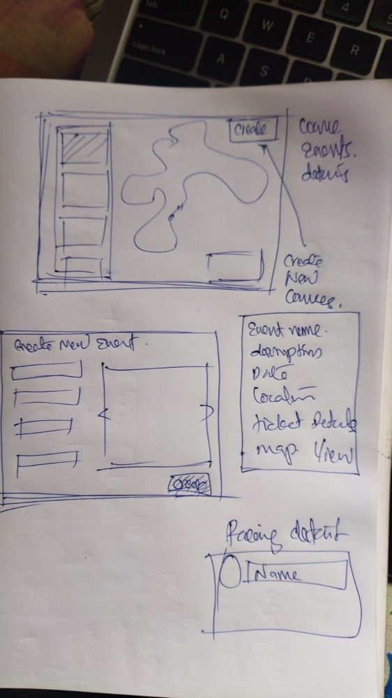
Hand-drawn sketch of the create-event flow, on paper
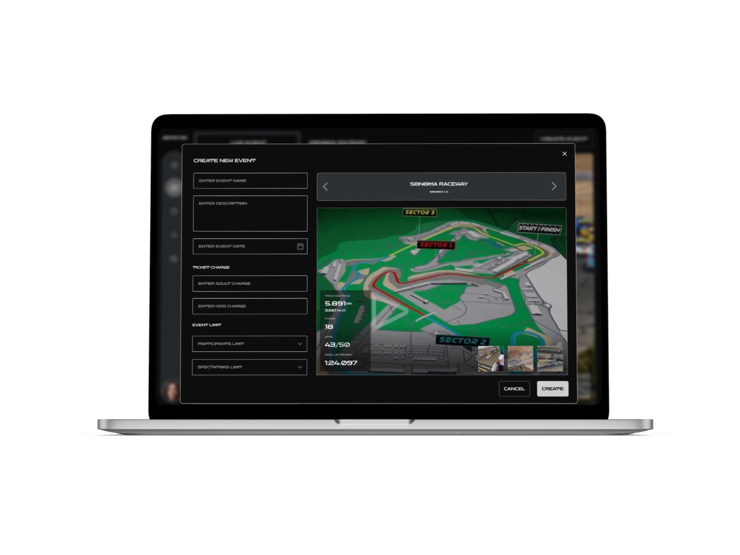
Working out the create-event flow the same way.
04 How I solved it

Three decisions that made 24 hours enough.

Scope

I mapped three audiences, then designed for one

Spectators, participants and organizers all have a journey through race day. I sketched all three, then deliberately narrowed to the organizer — the one person whose job is to see everything else. That single cut is what made the timeline realistic.

Visual language

Dark UI, for a bright, high-glare day

Race days happen outdoors, often in full sun. A dark, high-contrast interface reads better on a tablet screen trackside than a light one would — a small decision, but the kind that matters more than it looks like it should.

Device scope

Laptop and tablet, on purpose, not phone

Organizers manage from a laptop and carry a tablet. A phone screen is too small for the density this job actually needs — so rather than force a cramped mobile version, I left it out and gave the real devices the space they needed.

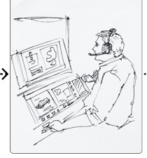
Sketch of race control coordinating over radio
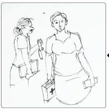
Sketch of emergency response and medical support
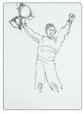
Sketch of a podium moment at the awards ceremony

Sketching a full race day, start to finish, is what told me which screens actually mattered.

05 The screens

The dashboard, and what sits behind it.

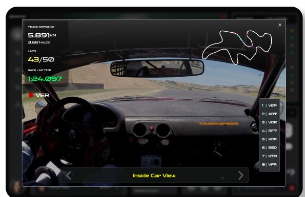
Five screens cover the job: the live command view, the driver's-eye track feed, the event catalogue, creating a new event, and the social numbers organizers are asked about most.

The full AMG Driving Academy organizer dashboard on desktop, showing the live track map, leaderboard, marshals, streaming stats, audience and team chat.
Command viewThe desktop dashboard — everything an organizer watches, in one screen.
06 Outcome

A day's constraint, six weeks of thinking condensed into it.

There's no usage data to show — this didn't ship, and I want to be upfront about that rather than dress it up. What I can point to is the shape of the thing: research, two personas, three journey maps, paper sketches and five finished screens, done end to end in the time it takes to plan an actual race day.

The real test of the exercise was whether narrowing the scope — one user, two device sizes, one dashboard instead of a sprawling suite — would still produce something that felt complete rather than cut short. I think it does: an organizer glancing at this screen would know exactly where to look first.

07 What I'd carry forward

Three things a hard deadline taught me.

Cutting the user list is a design decision, not a shortcut

Mapping all three audiences and then committing to just the organizer is what made the scope honest. It wasn't a corner cut — it's the decision that let the rest of the day go deeper instead of wider.

Paper first, even against a clock

It would have been faster to open Figma straight away. Sketching the dashboard and the create-event flow by hand first was still worth the twenty minutes — it's where the actual layout decisions got made.

A dashboard's job is triage, not decoration

Every module earned its place by answering a real race-day question. If a screen didn't map to something I'd sketched in the storyboard, it didn't make the cut.

Thanks for reading

That's the whole exercise, from brief to screen.

See the full working board (PDF, large file) ↗